Quantitative Synthesis displays the results of a nest’s Meta-Analytical Extraction. Use this page to drill down on the outcomes of your research by Intervention or by study (Summary page), to see the distribution of results across individual studies (Distribution page), or view inferential statistics and forest plots for comparisons within your nest (NMA page).
1. Navigate to Quantitative Synthesis #
Whether you have accessed Synthesis from the project itself or via a link, click on the “Quantitative Synthesis” box.

2. Explore Summary #
In the top-middle of the page “Summary” is automatically selected:

Default Summary View #
In the Default View:
- In the left column, Interventions are displayed down to the second level (that is, the nodes below the Root Node selected as Interventions).
- In the other 3 columns, Data Elements are displayed, and the most commonly-reported Data Elements are shown by default. In the cells below, results are broken down into:
- For Dichotomous variables, the event rate (n), total population (N), percentage (see Random/Fixed Effects), and a 95% Confidence Interval.
- For Continuous variables, the mean/median, standard deviation (SD)/range/interquartile range (IQR), and a 95% Confidence Interval.
- For Categorical variables, the event rate (n) for each category, as well as the total population (N) upon hovering.
Note: All Data Elements are classified as Baseline or Outcome during timepoint selection. The Data Element classification is displayed above each column upon selection.
From this Default View, you can manipulate the Interventions, Data Elements, and even statistic type to drill down on findings.
Random vs. Fixed Effects #
Across all Quantitative Synthesis pages, estimates and percentages displayed by Default are Random Effects calculations. To toggle to Fixed Effects (that is, an estimate based on an assumption of constancy or non-randomness), use the toggle in the upper left of the table.

Table vs. Visual layout #
The summary is displayed in table format to select up to three data elements to view alongside one another. You may wish to view the same data in a visual layout instead. Toggling “Visual” in the top right displays visuals for each intervention (or group of interventions if minimized) mimicking what you might recognize as a forest plot. This visual is intended to provide an alternative quick summarization of the presented data in a way end users may better understand and only displays one chosen data element at a time.
While the odds ratio axes and I^2 are not provided in this summary table, the data for interventions can be viewed in detail on the NMA page.

Expand Interventions #
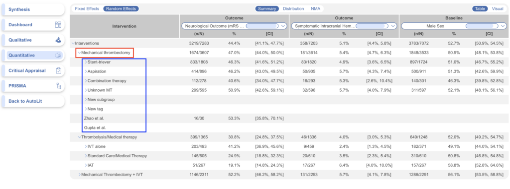
Click on an Intervention of interest (red) to expand down to see its children (blue) . This can be done recursively, meaning that if your top-level Interventions have multiple layers below them, each click will expand the next level down.
Choose Data Elements / Columns #
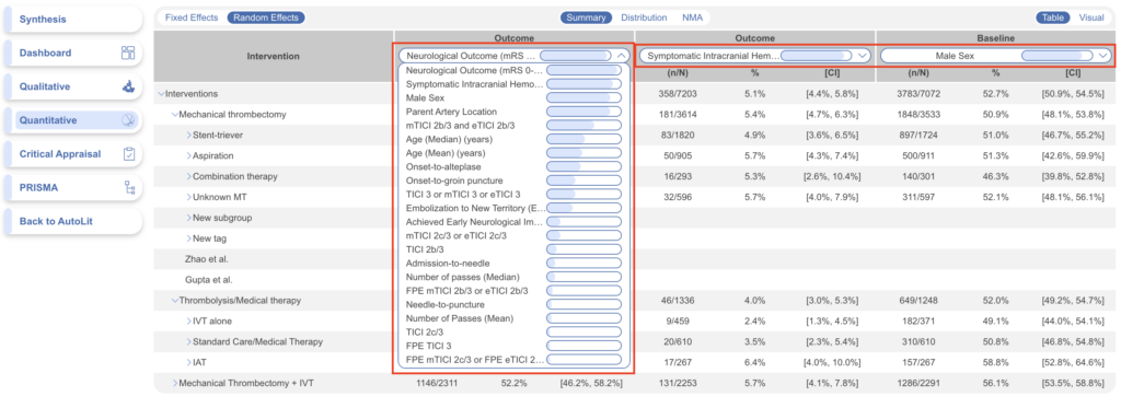
To choose different Data Elements, click on the drop-down at the top of a column, view the list of all Data Elements (with a bar that represents data density, or the rate at which it was reported across studies), and select the Data Element of interest.
View Individual Underlying Studies #
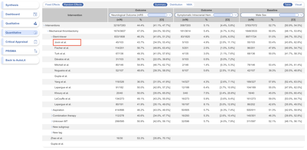
If there are no levels below a given Intervention, clicking on it will display the underlying studies and their associated Data Elements.
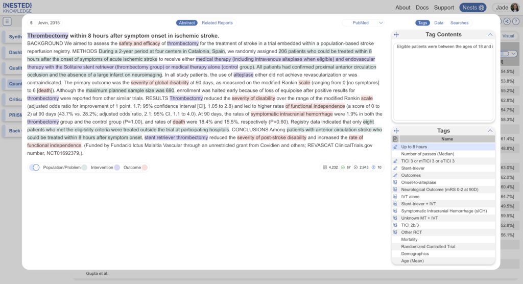
When selected, the study is displayed for exploration:
3. Explore Distribution #
In the top-middle of the page “Distribution” is highlighted. This page shows statistical relationships between “Male Sex” on Y axis and “Symptomatic Intracranial Hemorrhage” on X axis in a scatterplot formation.
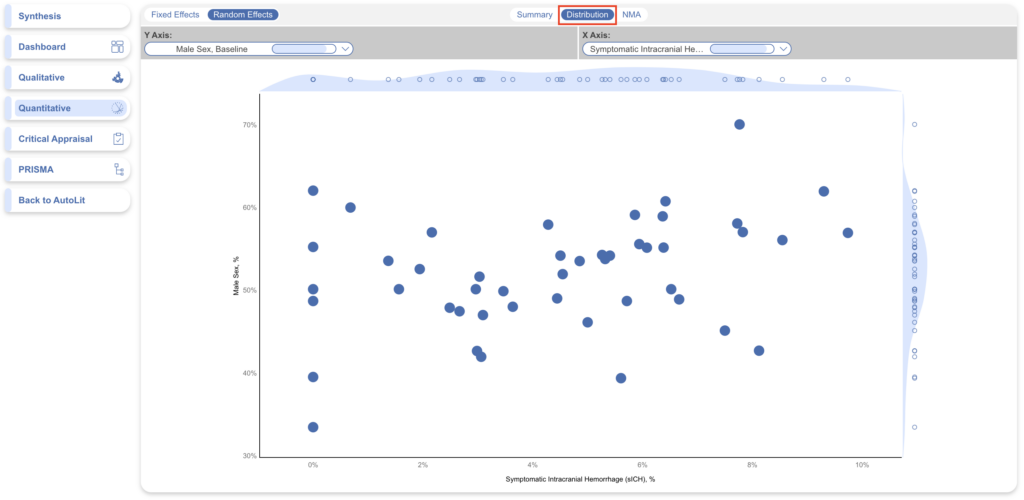
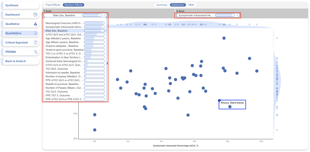
In this page, select the X and Y axes to designate the Data Elements of interest (red). This will generate a chart that shows the distribution of studies based on their rate of each Data Element. Furthermore, hovering over any node in the Distribution page (blue) will show you the study the node represents, and clicking on it will open a study modal showing the abstract, data, tags, and search history of that study.
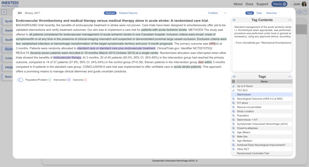
When selected, the study is displayed for exploration:
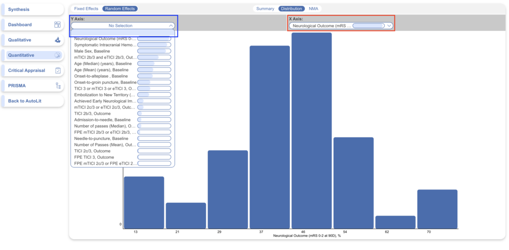
Histogram view: To view a histogram of findings for a single data element, select the data element in the X axis (red) then open the Y Axis dropdown, and click on the first option, which looks like a blank field. This will generate a histogram showing the distribution of findings across studies with respect to one, not two, data elements.
4. Explore NMA #
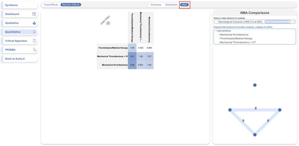
To navigate to the Network Meta-analysis (NMA), in the top-middle of the page, click “NMA”.
To explore the functions of NMA, see the Explore NMA page.
Filtering Synthesis #
You can also apply broader filters to view specific sets of studies via the Settings button in the top right. Learn more about Synthesis Filters.
5. Share or Embed #
Similar to QLS, you can share any of the Quantitative Synthesis pages by clicking on the share icon in the top right. You have the choice of sharing via a link or downloading a QR code.
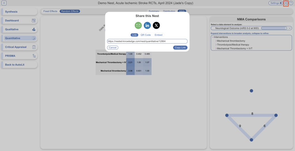
If your nest is public (see Settings to do so) you will also have the option to embed QLS into a webpage. Simply copy the HTML code and paste it into your site of choice.
Note: unlike in QLS, in QNS, there is no option to download a spreadsheet of filtered studies from Synthesis. Only nest users can access this data in Study Inspector –> Download –> MA Extraction.
Calculation Methods for Quantitative Synthesis #
To see how statistics are calculated for Quantitative Synthesis, including for the NMA, see here.
Reorder or Hide Tags #
Since the order of dropdown options reflects the order of tags in the tagging hierarchy, you may wish to reorder these tags. See instructions on how to Reorder Tags.
If you wish to hide tags in Synthesis, see instructions here. Tags will only be hidden in Synthesis and will still be present in AutoLit.

