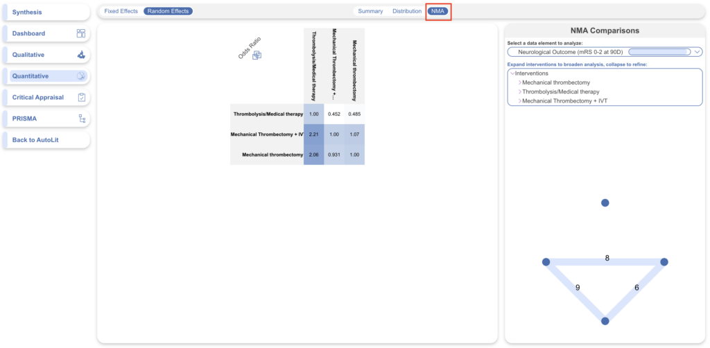
Nested Knowledge completes an automated Network Meta-analysis (NMA) on all dichotomous and continuous Data Elements with sufficient data, at any Intervention level. To see all calculation methods, see here.
To navigate to NMA: In the top-middle of the page, click “NMA”.
WARNING: The automatically-generated Network Meta-analysis uses generally accepted practices to calculate odds ratios and other outputs. However, you should use and interpret these findings with care:
- Comparative Studies Only: NMA depends on comparative evidence, meaning that the studies analyzed will only represent those with 2 or more Study Arms.
- Potential Bias: these outputs are only as trustworthy as the underlying studies. Any bias in the underlying studies will be carried through or even magnified by NMA, so completing an independent measure of heterogeneity and working to minimize bias are crucial steps, and even if followed, all NMA outputs should be interpreted with caution.
Default NMA #
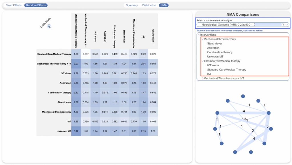
By default, your NMA page will show top-level Interventions (those just below the Root Node selected as your Interventions), compared with respect to the most-commonly-reported Data Element. Interventions can be expanded to view deeper analyses (red), and data element can be chosen for comparison (blue). In the below case it’s “Neurological Outcome (mRS 0-2 at 90D)”.
Odd Ratio Chart #
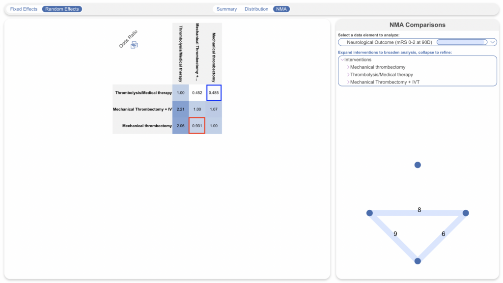
The Odds Ratio Chart shows all Interventions listed on both axes. The cells represent the odds ratio between the Intervention displayed in the row and the Intervention displayed in the column.
For instance, in the diagram below, the red box displays the odds of neurological outcome for Mechanical Thrombectomy plus IV-tPA compared to Mechanical Thrombectomy alone (0.931 : 1), while the blue box displays the odds of neurological for Mechanical Thrombectomy alone with respect to Mechanical Thrombectomy plus IV-tPA (1.08 : 1).
I squared #
In addition to Odds Ratios, the I squared value for the NMA comparison is presented upon hover over the three-box icon:
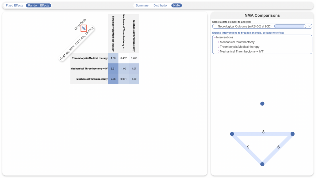
This will present the I squared value representing the expected impact of heterogeneity on findings (from 0 to 100%), with a 95% Confidence Interval.
If you adjust the NMA (change Data Elements or Intervention level), this will generate new Odds Ratios as well as a new I squared.
Selecting Data Elements and Interventions #
As mentioned above, to select the Data Element you would like to show odds for, use the drop-down in the upper right, in the “NMA Comparisons” panel.
To select the level of analysis for Interventions, use the listing below the Data Element drop-down. Like the first column of Summary, selecting an Intervention in this list will expand to display the next level down in the hierarchy of Interventions.
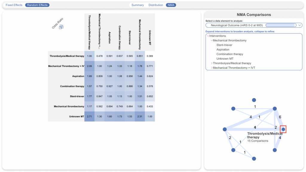
Once you have selected your Intervention levels, the NMA Chart will display the number of studies comparing each of your Interventions of interest below. Each node represents an Intervention (red; hover to see the Intervention title), and each line represents the number of studies comparing any two nodes.
Comparing Interventions #
To compare an individual Intervention to all other Interventions displayed in the Odds Ratio chart, select its title from either the row or column headers (red) or .
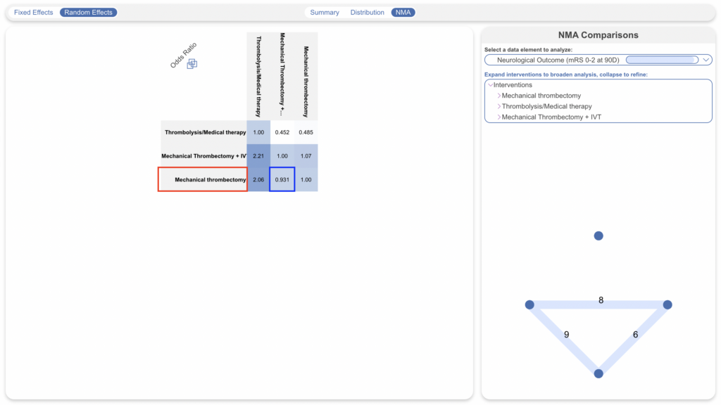
This will give you access to the following graphs (which you can exit by clicking “close” in the upper left):
Forest Plot (Intervention-level) #
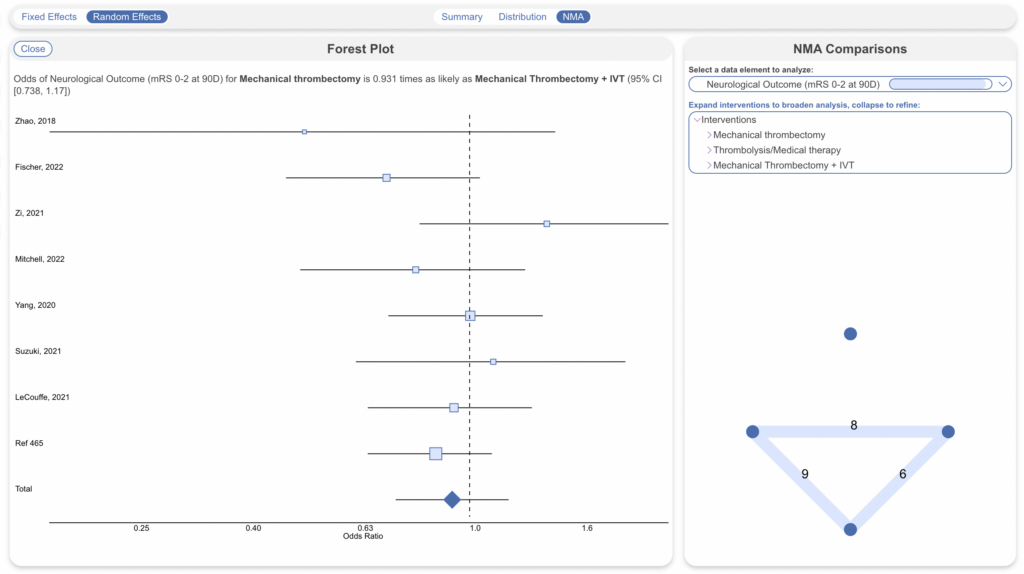
By default, you will see a Forest Plot displaying the Odds Ratio and a 95% Confidence Interval for the Intervention chosen compared to all other Interventions in the Odds Ratio Chart:
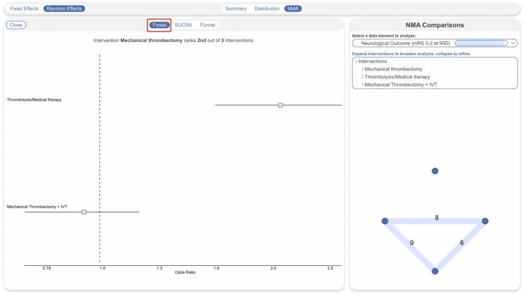
From the Odds Ratio chart, clicking on any individual cell will create a Forest Plot for the specific comparison represented by that cell. It will display the Odds Ratio and a 95% Confidence Interval for all underlying studies reporting the two Interventions being compared, as well as a cumulative Odds Ratio and 95% Confidence Interval.
The cumulative Odds Ratio and 95% Confidence Interval will also be listed at the top of the page.
SUCRA #
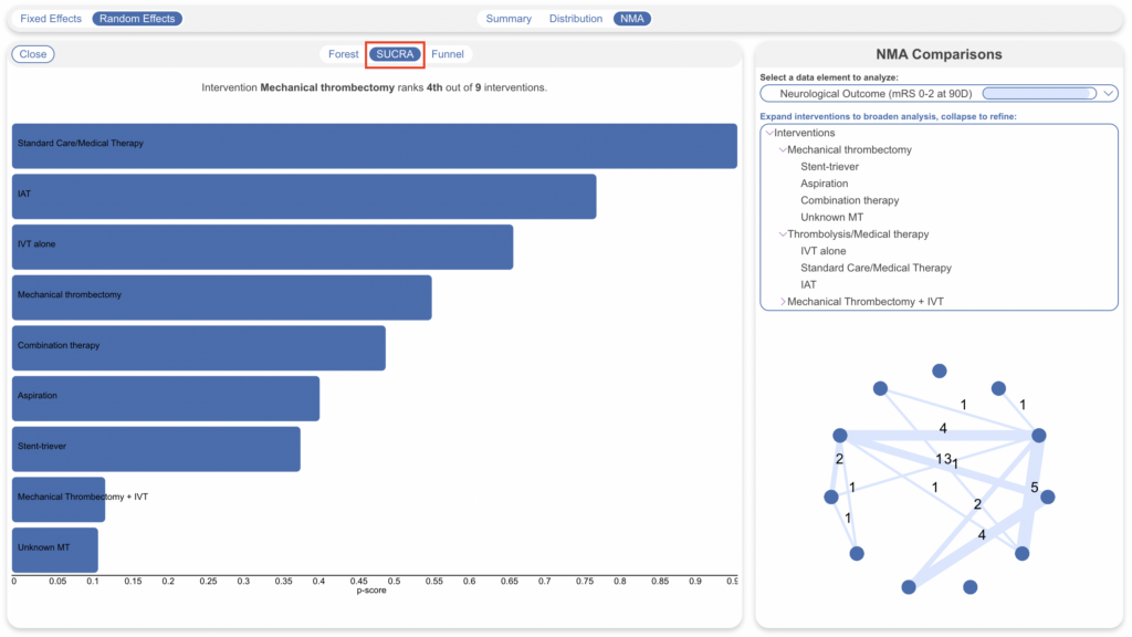
Toggling to SUCRA in the top middle will display a SUCRA ranking, which displays Interventions in order based on their odds of achieving a given outcome. So, if high odds represent patient benefit, the 1st Intervention in the ranking represents a preliminary estimate of where that Intervention ranks in terms of patient benefit. The below view is with interventions expanded for deeper comparison:
Funnel Plot #
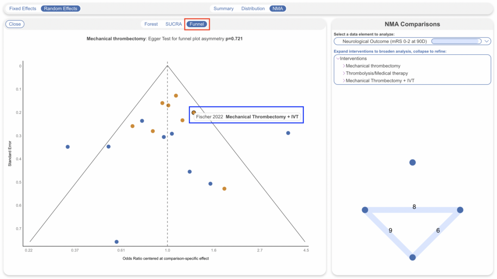
Toggling to Funnel Plot will display a Funnel Plot, which displays a logarithmic graph of the Odds Ratios from underlying studies against the inverse standard error. In this plot,
- Each study is plotted a a single node; usually, larger studies will be near the top of the graph, and those with more variance from the composite Odds Ratio are further away from the center.
- Upon hover, the Title, Year, and Intervention are displayed; clicking opens the Study Modal showing the Abstract, Data Elements, Tags, and Search History for the study in question.
- Since there may be more than one comparator, different Interventions being compared against your selected Intervention are displayed in different colors.
- A triangle is formed indicating the estimated range in which 95% of studies are expected to lie.
- Additionally, an Egger’s test is run to test asymmetry and the findings are shown at the top of the Funnel Plot.
